
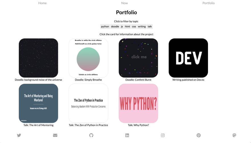
Having a fun portfolio has been really pivotal for me career-wise. I would love to help some other devs create their own kickass portfolios. I woul...
For further actions, you may consider blocking this person and/or reporting abuse

Displaying a subset of the total comments. Please sign in to view all comments on this post.
What an awesome idea for a thread!
I've definitely gone though a lot of iterations on my portfolio. The latest version is available here: joshuapullen.com/
I'd love to get some feedback! So far I've been keeping it pretty minimal; I'm curious whether you people think that's a good idea of if a more fleshed-out design would be better.
I love the look of this site. Simple, elegant, to the point, and the right things are highlighted. I think this is such an excellent example of a minimalist site with great design.
Also, teaching kids to code is the most fun thing ever :)
That's great to hear! Design is always a little bit tricky to evaluate on your own, so getting some positive feedback is nice. :)
As you said, teaching kids to code definitely strikes a chord with me. There's something incredibly satisfying about seeing people have eureka moments. Plus, with kids, there's a lot of excitement around elements of programming which I sometimes take for granted.
Totally agree!
Rocket Spelling rocks. Full-stop.
Design reminds me of everything I've heard/read about marrying the tone/typography/design to the actual content.
The animations are killer. Looks like you've been painstaking in your work on it.
Very nice work.
Wow.
-Beau
The site itself is very understated by comparison to what it links to.
I might, if I were you, consider again, perhaps the black bar at the top.
There isn't one at the bottom and so it distracted me a slight bit as though it might have some functionality--That is, I found myself scrolling up as far as possible because I thought I hadn't revealed the menu, or something.
This might be avoided if you have, say, a similar black bar position: fixed (?) at the bottom... In this way you might achieve symmetry.
-oh! it's just me, but I'd but some kind of fancy schmancy affordance for your blog link at the bottom.
nngroup.com/articles/guidelines-fo...
--It certainly doesn't detract from the design, tho. Very nice!~
PS
favicon is adorable.
Glad you like the look of Rocket Spelling! I definitely put a lot of time (and iterations) into it.
Interesting to hear your feedback on the black bar. I'll keep looking for an option to satisfy everyone (definitely getting mixed feedback so far).
Thanks for the thorough response!
Thank you Ali, I would love to have any feedback on my portfolio.
This is super cool and different! I love the stars on the home page, and it's very minimalist, which is good! I like the hamburger nav's animation too. I don't love overriding scrolling. I would prefer a single page I can navigate more easily. I don't think the "I am thinking" is necessary on simple site! I would just feature your stuff in a quicker to navigate way!
Yes I totally agree that the loading phase is overkill. I remember the reason why I did that was I wanted the site to be totally different, kinda accomplished that :)
1000% agree with the scroll. I couldn't tell what's going on
Hi Khang!
The delays and animations make the experience seem very slow to me. "I am thinking" and progress bars and so on seem unnecessary when it's really not a lot of content. If I use the scroll wheel to go down three sections it takes about six seconds because I have to wait each time. Without these delays it'd take about half a second and that definitely affects my opinion of the site's performance.
The thumbnail image of a site you made ("Natours") is over 2000px wide but you're using the browser to scale it to under 500px wide. That looks like a waste of bandwidth to me (nearly a megabyte), and I definitely noticed the image progressively loading, which adds to the overall slow feeling. Maybe you could preprocess it in the site's build stage to get that down to something more like 50Kb.
You're inconsistent in your language - for example, on the same "Natours" page you use both "css" and "CSS" in the same line. There are a few places where the sentence structure is incorrect such as "WHAT I CAPABLE OF" instead of "WHAT I AM CAPABLE OF", but that's nothing that getting a friend to proofread wouldn't fix. It's often really hard to notice mistakes in things you've written yourself.
I find the animations distracting and inconsistent: why does clicking the hamburger animate the background out to a menu but not back in when you close it?
I can use the scroll wheel to change pages, but it's not clear where I am on the page, whether there's a page before or after the current one, or whether there's content on the page I can't see because I can't scroll to it - if my browser is not tall enough I can't read beyond the top of any page. I have just noticed an animated arrow in the bottom right, but if I click it, nothing happens. I guess it's there to signify that I can use my scroll wheel, but it's not obvious.
I assumed the this was a single-page site where the hamburger menu took you to different lanes, but the names of the pages in the menu don't match up with the headings of the actual lanes. This makes me confused and if I use the menu to navigate and try to click on the current page (I don't know if it's the current page because of the name difference) it simply does nothing.
The whole site is inaccessible by keyboard: I can't change pages with arrow keys or page-up and -down, I can only tab between a few of the elements...
The page doesn't work without javascript enabled and thus there may be problems with SEO - I'm guessing SEO is important to you on a portfolio site! It looks like it's React, right, so maybe you could use next to help with that?
Wow thanks so much for such a detail feedback. I kinda noticed some of those issues but have not got time to come back. Again, thanks so much for pointing out my mistakes, that helps me a lot.
Not really a portfolio (yet), but [Momcilo Popov)[momcilo.xyz] design worked pretty well. People call it mysterious, and I am getting contacted via website pretty often. It even got listed in a few online web design collections. Definitively planning to add a blog section and a few case studies. Any other ideas? (besides changing that awful font :D)
I've never seen anyone do that full screen SHOUTING THE LINK thing you do when you hover a link before. It's... different. Kinda cool I guess? The problems I have with it (apart from the initial surprise) is that it's not there for every link ("touch" vs "here" and "here") and that the link text itself is often just "here", which is bad for accessibility and SEO.
Why is the ellipsis a button? I quite like that effect too - revealing the additional information when clicked - but it's not obvious that'll happen and I'm all about keeping my browsing experience low on surprises!
Even tho I totally understand your point, my idea was exactly the opposite: surprises and unconventional interactions :) But I improved accessibility a bit in this newer version :)
Oh! This is cool, very different. I wuold maybe make it scale on smaller screens so it's still one page. I also may not do the separate page on hover for the links, you can just leave them as links in my opinion. Really like the overall design!
Mine is on a CV format, so not all that exciting, but was fun to make using Sanity.io (which is a headless CMS) and custom
@media printstyles to easily create a printable PDF. Being able to edit it in the Sanity content studio has also come in quite handy.cough could I please point something out that's a little ironic?
Fix that as soon as possible :)
Thank you! Fixed it right away.
(Though I actually had to put it into google translate to find the error. Even though I thought I read it word for word I couldn't spot that "and" 😳. I think it's safe to say my "eye for detail" doesn't always work for proofreading.)
I'm in love with this portfolio. It communicates everything very cleanly, works on every size screen, and the print styles are the icing on the cake.
Thanks!😃
I've tried to make it easy for others to clone the project and use it to make thier own CV. You can find it at github.com/arnemahl/skratsj, would be awesome if it could be useful to someone besides myself.
Cool! I like this -- very professional and clean. It definitely gets the message across and shows your expertise!
Would love some feedback! Thanks in advance!
Harner Designs
One thing I've always struggled with is, because it's just me, should the voice of the site be saying like "I am Jack Harner" or "We are Harner Designs". I think, right now the site is kind of a mix of both, and that might be confusing/off putting.
I love the console message and the theming! Very "on brand"!
Branding
I think this is more of a business question than a portfolio one. I, personally, would keep it to just you and use "I". Somebody else may have better feedback there though!
Design
The earth jumps around for me after the first paint, but I really like the use of animations! Might be something to look into. I would stick to all navy instead of the navy and black, but that's just me!
I would make the full portfolio images a link instead of just the green button, especially since the pointer finger comes up!
Performance
I'm getting a couple paint issues where things are a little slow. I ran a lighthouse test and it looks like some images could be optimized! There are great instructions right on the test, so I would read through that! The menu dropdowns could maybe be sped up too!
Super cool site, love the space theme!
Thanks for the feedback and compliments!
ya, I think I'm going to try to redo that whole banner animation using Canvas. Hopefully be a little more performant than just animating SVGs.
Are you talking about the slides in the Recent Clients section on the homepage? Those Images link on my end, but it might be an browser/os issue. Are you on Mac?
Oh interesting! Yeah, Chrome on Mac.
Jack thank you for your feedback on my portfolio earlier today. I visited your page and was impressed by your graphics and illustrations. One thing that bothered me is how wide your forms are particularly here and towards the bottom of your homepage. For example, I entered my name in the 'Name' field and my full name takes up ~25% of the entire field.
Great portfolio and projects!
Jack -
Mojave/Safari 12, the images in Recent Clients are all missing. I even tried reloading without my content blocker. Oddly no errors in console I could see, but might double check it's not just me. They load fine in Chrome however.
As for the voice, I'd suggest thinking about how you want yourself to be viewed by others. Are you a one man show or are you a giant company? How do you want to be seen? Is it worse for me to think you're a giant company and find out it's just you in a WeWork space? Is it better for me to know you're solo, but awesome, and that I'm getting your full attention? Both have pros and cons. My advice is to think about how you want to be seen, what questions clients will ask (ie. "what happens if you go on vacation?") and then decide and be consistent.
IMHO I'm not a fan of pretend to be a giant company when you're just one guy. But that's just me and I could be totally wrong :)
I'm actually in the process of redoing my personal site right now. Most of the content on other pages is placeholder and will change soon, but I'm trying out a new idea for presenting projects and talks.
Again, the content for each project is incomplete, but I would love feedback on the functionality and design. Oh, and the button filtering is wonky. This is my staging site and totally should not be viewed as production ready 😅
Awesome! I mostly use mine for speaking gigs now too! I'm also a huge fan of the Zen of Python!
I didn't get this exactly how I wanted it, but I changed some sizing/ordering in order to emphasize stuff and use more space!
I also struggled to close the modals, though I love how much info you give on your projects!
I found a couple of glitches:
From an accessibility point of view, the links are too low-contrast, and the only way they're distinguished from body text or for their hover states is by a very slight luminosity change.
The social links have no content, so they can't be used with a screenreader, etc.
You can't use the keyboard to navigate through the thumbnails because they're not really links.
The filter buttons could be bigger, because they're a little swamped with the other components on the screen.
It's not obvious that the filters are ANDed together until you experiment. My assumption was that clicking one after another would have removed the first filter. Perhaps they could be made more obvious with some kind of checkbox-like states?
Other suggestions:
esckey dismiss the modal.I actually think that since this is a page about showing off a few things that you've done, and there's a manageable number of them, that just displaying things one after another would be fine, rather than using the modal effect at all.
Thank you so much for this thorough review! I’ll definitely take a couple things under advisement, but like I said before, this is a staging site for my portfolio where I sandbox things to play with, so it’s missing a lot of content and listing everything out would not be good.
I have an updated local version that I think already addresses a couple of these issues that I just haven’t pushed up yet. If you’re interested I’d love for you to take a look after I’m done. Thanks again.
All that being said, I’m a data engineer who Is touching JavaScript and CSS again for the first time in 5 years just for this site and a couple doodles, so if you have any advice on how to do things like sizing things from an accessibility standpoint, or places to test contrast between two colors, that would be super helpful!
First off, thank you for doing this!
My portfolio is carmenwright.xyz
I'm in the process of moving from web design to UX design, so a lot of the wording is not correct. However, I want to start applying soon for related jobs (once I'm finished with my course) and wondering if my portfolio is too "basic" to show my skill or doesn't have enough on it (for example, more UX centered case studies and not the newsletter design or branding).
Thanks again for this opportunity!
For sure! I love the long form project descriptions, you could almost make them into blog posts and post them here 😉! I would have clear calls to action to contact you and hire you since you will be looking soon! Emphasize those links so that people follow them! The navigation is really smooth. I would make it super obvious that the projects are clickable -- maybe make them into cards or add another visual cue. I would add a max-width to your header text so that it is easier to read on large screens! Looks great!
I had originally posted my case studies on Medium, and linked then back, but that irritated me for some reason, so I did that switch. I hadn't thought of posting them here, so thank you for the idea.
I'm definitely going to include those CTA buttons on the next round of adding code.
Thank you so much for this review! It's very much appreciated.
Hi Carmen!
Very nice work!
dropbox.com/s/kyrjf37u07egt7o/carm...
Here is a dropbox to your hero image.
My wifi connection is 💩. So I noticed that your hero loaded rather slowly.
If you have photoshop, if you open imgs up and press cmd + alt+ shift+s --it will open in an interface to prompt you to decide the size and dimentions and (most important for performance...) "weight" of the image.
This little feature just may become your best friend if you use images when you develop.
The image I posted above is lighter and of lower quality, but is significantly quicker to load.
I wish I had a good link for more info on this....but... check around. It's actually a bit of fun and an interesting challenge to get all images on your site to about 100 k (?) --Perhaps someone who knows about perf, could weigh in here 😂🤣.
Anyway...
It's a very nice site.
PS Your Richard III cover is amazing on Behance 👍🏼
Thank you! I've had problems with that image and the one I used in a previous iteration. To be honest, I thought it was my WiFi, so I hoped it wouldn't affect anyone else's use of the site.
It's simple and it works. My only suggestion is to limit the width of your text because on a wider browser it becomes unwieldy. Something like,
max-width: 60em; line-height: 1.5;?Perfect timing, I've just started to revisit my personal site with a completely custom theme, based on Bulma! I haven't taken it live yet, but because Netlify is wonderful, I've got a preview I can show you.
caseyjbrooks.com
Here are a couple of sepcific's I'd love some feedback on, but any tips are greatly appreciated. It's still very much a work-in-progress, so I'm mostly just looking for general tips for better design and usability.
I really like the cards and the font sizes -- super good looking, and the colors are different but cool! I would remove the background image on the side panel, just keeps the clean theme going. I would also make "about", "blog" and "contact" bigger since you really want people to go to those pages! I would make the fonts on your about page bigger! I would show all your blog posts on a page so that someone can see all of them at once, maybe with images so that people are drawn in to read them! I love the cards though, again!
Thanks for the advice, and I'm so glad to hear you like the cards, I was really wavering on that!
I actually chose the colors trying to compliment the sidebar background, but maybe I'm just partial to it because it's one of my favorites from my gallery 😇I had originally used a solid color for the sidebar and didn't like it much, but I also didn't like the original colors at all either, so I might like it much more with a more muted palette. Lots to play around with!
And I do have blog listings, but I have not gotten around to making those look nice yet, it's just a list of links. I do link to these archive pages from the homepage tiles, but I will definitely try to make it more obvious how to view the archives.
Oh, your art work is awesome! I'm just biased against background images in general I think -- just think it usually detracts. I would maybe put the cards on a separate page then, and just have art/your name/links on the home page?
That's really nice. I like the separation of the section with the grid as its background.
To be honest, my first impression of the homepage was the word, "Christ". It jumped out at me and I immediately wondered what that was about and scanned around the page for any mention of anything that wasn't code. I found stuff in your personal blog ("musings") but that's kind of buried. I expect you were going for the three-word-alliteration that makes a lot of catchy phrases pop out and I know that developers often throw the word "coffee" around in conversation like it's a conjunction but I feel that if you're going to put religion front and centre you could maybe devote more home page space to it?
I don't think the tiles are too cluttered. There aren't too many of them and while there's perhaps not much to distinguish between them they've got their own space and are well-named and easy to glance through.
I think your layouts are nice the way they are; there's pretty much nothing I would change and I think that changing fonts might just be tweaking something for the sake of it. I do think that using a typewriter font would make things harder to read though so I'd advise against that.
Looks great! I would definitely use caseyjbrooks.com over 5bedafbcdaeb0a2d6bd167db--caseyjbrooks.netlify.com. Netlify has super simple domain settings and free HTTPS setup!
https://app.netlify.com/sites/(site-id)/settings/domainDear All,
This thread is such a great idea.
I have worked on this a great deal & am completion. I would love any feedback on it.
It would be very much appreciated.
beau.haus
-Many thanks,
Beau
This is super great, I love the design of it. Agree that it is hard to read on smaller screens. I would also make it so that the links don't move on you! It makes it a little hard to navigate. I might also make the UI for the
codedpage a little clearer, I was a little confused on how to see everything. I'm not seeing anything on theconnectorlearningpages as a heads up. Super incredible design!TY Ali!
THANKS so much for the comments! –great advice for the movement of the menu links. It's overkill. 🙄.
I like animations, but perhaps the goal isn't to confuse and frustrate visitors #whoKnew?
:D
Anyway... thanks for this thread.
awesome idea.
Oh wow, my instant reaction to that page animating in was that it's great. Even the favicon fits the theme. It's really beautiful but it doesn't work at smaller browser sizes - it quickly becomes too small to read. If your audience was guaranteed to be on a large screen I'd say it's one of the coolest sites I've ever seen.
This is one of the nicest things I've read. Thanks so much for the feedback, Ben!
This is an awesome idea. I released the first version of my site last night, so timing couldn't be better. I wouldn't call myself a dev, but I appreciate your consideration/review! Here's my site: butnotsimplr.com
Specifically, I'd like feedback on:
Thanks!
I love this! So unique!
I love this site, so unique, and really shows off all your projects in a quick look!
Woo! Thanks for checking it out. And for the compliments. Your suggestions make a lot of sense. I've already made the smaller adjustment edits (animation speed, font size, cards height), and will work on another way to communicate skills besides just the bar chart.
Again, I appreciate your consideration :)
I currently don't have any portfolio and by seeing your thread I am very much interested in making one.
I had thought of making a portfolio previously but I stopped because I am a developer and I haven't designed anything and dont know what to put there
I have worked on 7-8 projects in my two and half years as a Ruby on Rails & Javascript Developer. It was not a freelance job I worked for the companies and they had provided me the oppertunity to work on it. So I get confussed what to put there and how to design things.
Can you advice me on this please.
My advice?
Start small. :)
Name 20 nouns, 20 adjectives, 20 verbs that you want to communicate to visitors.
This might give you a hint or two about, color palette, typography and over-all feel & design.
Take a day and look over them. Look at other portfolio sites on this thread! Look for stuff that catches your eye on codepen.io, even! Search for portfolio, for example.
Then for content
Do 4 simple single word menu items.
Home | projects | lessons | CV | contact
Easy-peasy!
Take a screenshot of your 8 projects... (hmm 8 cards 🤔... I see a nice, tidy grid in your future :) ).
Don't get overwhelmed and overdo it. Just keep it simple...
for "lessons" do 5 sentences on smth you learned last week that's been on your mind.
Do one entry a day---Boom~!
CV is a link to a .pdf
&
Contact is what I click on to hire you! :) . --Look at what others you admire have on their "about" section.
Again, don't get overwhelmed & perfectionist about it.
Just do one bit at a time & promise yourself you'll post your progress on DEV.to for example! :)
k... I see I've written a novel.
Good Luck!
thanks for the information I will try to make my own by implemnting the advice.
Awesome -- here's a post on portfolios, here's one on design! I would maybe just put any personal projects on there!
thanks.. i will surely take a look and make my own and again ask you for review if thats okay.
Thanks, Ali for doing this.
Your portfolio was what got me into doing mine actually!
I'd love any kind of feedback on my portfolio karam-malkon.netlify.com/ you can be cruel, as it's still a WIP.
Hey! Awesome. I really like it. The colors, animations, and fonts are great, and it's easy to navigate. I would just hide projects/about until there are a couple things there. I would also add icons to the Contact page! Looks great!
Thanks for the feedback!
I totally agree with the icons, will do that!
What sort of things would you suggest to add to the About page?
Oops sorry -- the about page is good -- meant blog/projects!
Oh, that makes sense! No worries.
Have a nice day :)
I love this idea and your portfolio site! Mine has been sitting stagnate for a while, and I'd love feedback from anyone. It's viktorkoves.com
I'd love feedback particularly on the homepage. The changing background feels dated at this point, but I'm not sure what I can do instead of it that will still feel interesting. Also, I use overlays a ton for my projects, and I'd love to see if folks think that's fine or I should split it to separate pages.
Thank you so much! Yours is super unique! I would maybe have cards that show your photos, gallery, and portfolio instead of changing the background! Your bio gets a little lost right now, I may make it bigger or just emphasize that + navigation on that home page. Your gallery looks great! Super clean, so do your projects, though I may make it so that you don't have to click as much to get all the info on your projects.I would also maybe add images for your blog posts to draw people in! Cool portfolio!
Thank you so much for your feedback, I really appreciate it! I hope to take that into consideration when I have some time to get a redesign going.
Thanks for doing this Ali! Just recently started following you and doing the code challenges you post. Great way to start my morning! As a newer dev, I'd love any feedback you or anyone else has! Thanks in advance. Mrjaketomlinson.com. :)
Hey! For sure. It looks very professional and clean. I had some performance issues where it was taking a while to load the first time. I'm not sure if that was my network or not, but I would run a lighthouse test on it and see if you can optimize for performance there! It looks really clean and professional. I may up the contrast on the navbar to make it a little easier to read! I wouldn't justify the about text, it can make it a little harder to read. The cards are great, they show off the projects and get you to look at them. I think the skills section is great too. I may add a little spacing to the contact section and add another resume link on the page, think it gets a little lost. Great portfolio!
I think the performance issue might be a result of me hosting the site on Heroku. The free version stops the server after 30 minutes of inactivity and the server has to spool back up when someone requests the URL. Do you have a preferred host?
Thanks for taking the time to look it over!
Oh! Okay yep, that would do it. I use Netlify or GH pages for static sites.
Hello Ali, I would be happy to get your feedback on mine, it is shinyuy.github.io/portfolio
Please what do I need to improve ?. I mean I would appreciate any advice, whether on it design, skill set, projects, or if it can get me a job.
Hey! On that page, I'm just getting a navbar and that's it -- I wonder if there's an issue with the routing? I would also make the homepage shinyuy.github.io instead of at shinyuy.github.io/portfolio!
Here's what the page looks like for me for context!
Okay thank you very much, I am working on solving that, I don't know what causes this, cause on localhost, its normal showing the full landing page, but immediately I host it on GitHub pages, I get this issue, though clicking on that link portfolio on the navbar then displays the full landing page. As for changing the URL I think I will do that. So please I would appreciate if you clicked on portfolio or the other navbar links on the navbar and give me feed back on the other things that need improvement. Thank you
Ah okay, if you're using React router or something along those lines, you may need to tweak some settings! I like the boldness of the resume page with the contrast! I would make sure the picture of you isn't stretched out! I would also reduce the space between the years and the titles for your experience. I would add some spacing to your about me. It will make it easier to read and draw people in! Even bold some text and make it bigger, you have space! I would also be consistent on fonts from page to page! Same thing with your projects, draw the person in with an image or something! I would also test the site on different sized pages and make sure it looks the way you want it to in all cases.
Cool design, very clean!
Thanks a lot for the detailed feedback, I appreciate it and would make those adjustments while waiting for your test.
What do people think about using the common portfolio templates that are out there?
I had to pull together a quick portfolio for a deadline and used the grayscale bootstrap portfolio template linked below, (yes I haven't changed the url yet since my regular github.io page is linked to a side project).
As a developer I am inclined to say that it is ok to use a template since I am focusing more on my projects and code than I am on a ux/ui or designer experience.
Thoughts?
mmunier44.github.io/mmunier-portfo...
I think this looks unique enough that you can't immediately tell it's a template! I personally steer away from them because a portfolio is really where you can show off your skills without any constraints. Also depends on the type of dev you are. If you do Linux mostly, maybe writing a site isn't the most important, but if you are a frontend dev, I would lean towards writing it myself.
Awesome thanks so much for looking!
GO GA WDI!
I maintain my small blog, where I post my code adventure and my experiences, which I gather at work: My blog. The blog was made with React and GatsbyJS and its hosted on Netlify with a git pipeline behind it to deploy new articles.
I was recently considering redoing my current Jekyll portfolio site with a very similar stack, mostly to provide myself with a reason to become more familiar with React.
How has your experience been with it so far?
I think the hardest part for me was to start developing. If you are already familiar with React, then learning Gatsby is not that hard at all. But for me, it was the beginning with React. It was pretty confusing to start writing React-specific code... And it still is. :)
Cool, this is a little different from a portfolio, but I would make it so the logo and the gradient coordinate. Maybe make the logo purple too? Also, the links on the bottom confused me a little, maybe add icons or spacing!
Hey! I love Gatsby! I don't think you need the gradient. I think it looks cleaner all grey! I would also make the links at the bottom clearer. Maybe use icons or add spacing! Cool blog!
Mine is very simple (and needs an update), but I love me a good gradient :D
Wuz
Heh, you're not alone there.
The "Final" logo looks bad against it though, so I'd be careful. Maybe you could put the logos against a rectangle with something like
padding: 1m; background-color: rgba(0, 0, 0, 0.25);:The page title could be something better than "Home - Howdy I'm Wuz." for bookmarking and SEO purposes.
Your site doesn't work at different browser widths - anything under 680px is broken:

Fix those points and it'll get a thumbs-up from me :)
Thanks for the note! The Final logo looked better before I updated the gradient, I definitely need to fix that up. Good call on the smaller viewport rendering. I haven't done any sort of SEO optimization on the site - but you are totally right, a better title is a great idea. I need to chunk some time into it and these are all great starting points!
I love the gradient! And your logo! Awesome!
I think I like it in a column instead of side by side. I would also add more hierarchy to the text sizes to emphasize different content!
Hmm interesting! I like that as well! I'll have to play around with the layout a bit! Thanks for the notes! Text hierarchy is definitely something that could use some work :D
That gradient gave me life!! I love it!!!
Hi Ali,
I'm game developer and I'm bit confused on how to represent myself on my portfolio.
All texts went through many friends and revisions, so actually they're not mine. Mine sucked to be honest (after comparing it to the revisions of others).
May i ask you if you would be that kind and have a look?
Thanks in advance.
Hey! Cool site, I think the descriptions are great. I would make sure they're easy to read, though I would make the font white on the dark background, and maybe make it a little larger. I am not sure if the top image is saying much about you -- I don't think you need it! Maybe just have your name and something about you. Or make your about a little bigger! I would also either make the contrast between sections a little stronger (so some sections darker some lighter) or just make them all a dark grey. The black, dark grey, and dark red are so similar that it doesn't add much. I think it gets the information across really well though! Just make it easier to read!
Ah, thank you for your feedback!
Interesting, the contrast would be the last thing I would consider as something that should be changed.
Unfortunately, the site is made through system equivalent to wix.com, so I can't edit the colours. While ago I was "porting" the theme to my custom site. But that is still work in progress.
And you're right about the Jumbotron image, it's big and useless. I think I should spin the design a bit.
I honestly thank you, mainly for the opportunity you gave to devs to have feedback. I hope this will be in the top 7 posts of the week. Have a nice evening.
Chriss.
That's tough! I would maybe use a HTML/CSS template and upload to GitHub pages?
Hmm, sounds easy enough, but my experience were bit different :(
Thanks for the tip
Great thread! Would love feedback on my portfolio as I am currently breaking into software development. Thanks!
Nice job overall! I was looking at the mobile site on Chrome on a Galaxy S8+, large screen. Your portfolio is clean, clear, to the point. Here are a few small things that might help make it better.
I think your link is missing the
http://, because it links to a subdomain of dev.toThe social media icons are covered up by the background photo (sorry - my screenshot doesn't seem to want to attach). I'd space them out and give them a background.
I wouldn't say you're "looking to break into" your "first job". It just makes you seem less experienced and more junior than you are. I'd describe what kind of work you do, and what kind of jobs you're looking for, rather than emphasizing that this is your first job. Google "don't say junior developer" for more advice on this.
This is personal preference, but your project cards lead to the GitHub repos. This is great, but are these projects also deployed anywhere? It might be nice to have the live links alongside the code for less technical recruiters or anyone that might want to see your work live.
Again, nice job! Hope this helps :)
Thanks Max! All great points -- will loop into the icons and having project cards link to live versions of the site (as well as framing my experience in a more positive light). Appreciate the feedback!
Hey! Cool site! I would make it so that the first section takes up 100vh so that you don't see the next section! I would also make the links at the top larger and spaced out so they really draw the eye. I would expand on the "business side of startups" part of your bio-- that will be so helpful for companies, sell that! I would lessen the shadow on the cards, and maybe make them bigger! I would also add your social icons to the footer. Nice portfolio!
Thanks so much! Appreciate the feedback -- will incorporate shortly!
I have personal Tech Blog maintained at adityasridhar.com. Would be really happy to get your feedback on this :)
I like the fade in for the images! I would make the tags on them easier to read, and I'm not sure if you need the header image on the page! I also may do a big image for your latest post so it is super emphasized. I like it!
Thank you for the feedback :)
Will make those changes.
Also is it necessary to have a separate portfolio and blog site?. Or is it fine to have them both in the same site.
Totally up to you and what you're trying to do! My portfolio is mainly for speaking and media engagement at this point, so that's why I have one.
Thanks for the response. Will think about this. For now planning to have them in the same site
I think you should re-create your logo image because it looks like it's a little fuzzy compared to the sharp text in the rest of the header.
The tiles have categories overlaid as pill-buttons, but they're inconsistent in their order ("programming" is before "web development" on one and the next is the other way around) which makes it a little harder to scan. They're also difficult to read against the lighter parts of the background pictures.
If you added a little margin under the header or some padding around the logo then I think it would look better at smaller breakpoints. At the moment it's a little cramped:
This is an awesome and very inspiring (you are all so creative!) thread! I would also love some feedback, here's my portfolio. And, for context—I'm a student looking for internships. Thanks in advance!
Hey Marissa! This is super cool, I love the simplicity -- and the Dev.to link! I would make the font sizes in the nav bar a little larger so that people really see them. I would also add some caption below your name to differentiate yourself i.e. "Computer Science Student and Astrophysics Reader" or something along those lines. The quote will overlap the projects headers on some smaller screens. That quote looks a little off balance to me -- maybe make the rectangle a little smaller? I would also use a lighter brown so that it's easier to read the text! I would make your bio text larger too! It's also a little hard to read the captions on your project tiles, I would make the font larger and maybe darken the brown. I would add the social links to your header, and make that available throughout the whole scroll for easy navigation. I may also do a fade in instead of the circular animation for the brown on the social links. I really like how simple and elegant the site is!
I love the idea of adding social links to the header, will definitely implement that change along with the other ones you mentioned. Thank you so much for taking the time to not only look at my portfolio but also give meaningful feedback and ideas, I really appreciate it Ali!
For sure!
It's simple and it gives all the information it needs.
I don't like the splash page - making text jump around is bad from an accessibility point of view and I feel the page serves no real purpose. And why do I click a down arrow to get the site to slide in from the side? I spent a minute using the keyboard and scroll wheel to no avail before clicking the link.
The three big circles are also an example of mystery meat navigation which reduces the overall UX of the site.
I think it would be improved if you removed the splash page, made those links clearer and possibly if you increased the
line-heighton your left-hand-side text (the bit starting with "Front-end developer...")You use a lot of font variations and play with text and that's not to my taste; I wouldn't do that on a website for a client but I don't want to say change it on a personal site - it's just your expression. I like the way the text on the right hand side deliberately overflows its background.
Awesome advice. Thank you so much for taking the time to check it out!
Great post, I’m loving all the beautiful portfolios of such talented front end and web devs.
I am curious what your thoughts are on portfolios or personal sites of back end or database devs. How do you construct examples of projects that are in the same way visually compelling to describe dev work that is purely back end or unable to be shared because it would be putting company data out on the internet?
I think with company work, I would instead just put a description of your job at the company instead of the project. For backend work, I would include descriptions of projects with links and just a minimalist site-- you could even use a template!
Good advice... and less work for me to do :)
I like the idea of a simple template, or even just a landing page.
I'm late to the party but I'd love to get some feedback on mine. :)
josiahschaefer.com
I love the theme of this! The octopus is adorable, and the site looks great. I may re-order your portfolio section, I would move the Wordpress sites to the top, since those are professional projects, unless you're trying to transition to working with the other technologies more. You have so much on there, that I may just add a link to your codepen instead of keeping the projects there. I also may add another way to contact you outside of the form. I really like it!
Awesome! Thank you. :)
Your thread came in a perfect timing as I'm in the process of developing my portfolio website!
It's not done yet, but I made this landing page which is part of my portfolio, and would love to get some feedback on it.
Thanks in advance!
I love the purple and the font you are using! I would just check out the computer image warping on different screen sizes.
Will do. Thank you very much!
I'd love any feedback on my new simple portfolio at tobiashaugen.se/ Thank you!
I love how minimalistic this is! Looks great, very clean and simple. My one tweak would be the header font -- it's kind of hard for me to read for some reason -- I may try Playfair? It has a similar aesthetic but is a little easier to read!
Thank you! I'll check out Playfair and play around a bit more with the fonts to increase readability.
Cool! I would lean into the minimalist thing, I don't think the background picture adds any more info about you. I would just stick to your picture and the links out. I would also make the font bigger on mobile phones and tile the links instead of making them into a line. I think minimalism is usually the way to go!
Loving this discussion! I'd really appreciate some feedback on my portfolio from y'all :)
Awesome! Few notes on improving it.
Hope this helps! Let me know if you have any questions.
Thanks, Chase! This is really helpful.
I like the simplicity of your site!
I actually prefer the navy theme. I would just use that!
I would add text spacing and sizing so it takes up all the whitespace on the landing view.
I would make the projects into cards so that you can see more at once and don't have to scroll as much!
I think the picture under contact is a little confusing to me, maybe put that in the about? Also, add in your GH/LinkedIn links in that section too to make them easier to get to!
Awesome site!
Thanks, Ali! This is really helpful. I've heard a few people like the dark mode better; so I'll probably switch to that. Just so I know, were you looking at the site on mobile or desktop?
Thank you for this! Here is my first iteration of my portfolio but I’m afraid it’s too simplistic: rosannaschaefer.com
Rosanna! I love this! It's gorgeous and a ton of fun. The perfect level of simple. I really think it's perfect. I would just make the landing view take up the whole view so that you don't see snippets of the next section, and make the scroll text larger. I would also add a little padding below "get in touch". Awesome portfolio!
Thanks so much for the feedback!
I really like it! I don't think it's too simplistic. I think the design flourishes are creative and elegant, and scrolling is smooth. I checked it out on mobile and everything looks good. The only missing element for me is a short About Me - a few sentences about you and your inspiration or philosophy. Also, on mobile, I would put a little bit more vertical spacing between your projects.
Well done!
Thank you Max!
For sure, I love Vue! I like the fun facts, definitely different -- maybe make them about yourself since it's your site? I may make the image a little bigger so it's clearer too. I would add a background to the about so you don't need the text shadow. You may want to add pictures for your projects to draw people to view them! Cool site! Also props on the navigation --very clear and easy to figure out
Awesome idea and great to see what everyone else is doing with there sites.
This is mine - jondeaves.me/
What I've tried to focus on with this iteration was being fast, keeping things pretty simple, being responsive and accessible and easy to manage. Was also a great opportunity to do more work with React and CMS stuff.
It should also work just fine without Javascript :)
Awesome! I think it looks really professional, and it has the relevant information! I would make the text bigger -- you have space! The projects look awesome, really like those. Your about page looks good too! I would add your project write ups to your blog! They're already pretty much blog posts, then you add more content to that section! Nice, polished portfolio!
Hello! Front-end dev trying to get a junior or entry position. I just spent a lot of time redoing my portfolio site and would LOVE feedback that might help me get my foot in the door.
gloriacho.com
Thank you!
Hey! I love the picture, so many great colors! I would try to use more of those in your site. I would also try to get all of the information above the fold, so that people don't have to scroll, they can just click from section to section! I would also use a very dark grey instead of the black, so that the white text bounces less. I would also use dark grey text on the lavender, the white is a little tricky to read! I would increase the size of your text on your bio so that it's easy to read. I would also put the bio next to the image so that everything fits above the fold! I would add some space so that there isn't the white space on your 'work' page on smaller screens.
Hey 👋Ali, great discussion and very timely too. Do you mind checking out mine? Do I get bonus points for the DEV badge 😃
lawyerscode.co.uk
Awesome! I love purple, and your domain is 🔥. I would add more margin to the left and right of your home page on large screens, just to add more balance. I would also increase the size of your icons just a smidge. Definitely bonus points on the DEV icon!
I would also make the nav an actual navbar on large screens, so that the user only has to click once to get to another page instead of twice, though the hamburger does look great! The pages look good too! I would use a dark grey instead of black on the projects page, just black on white can be hard to read!
Looks awesome!
Thanks so much! Double thanks for the quick turnaround. Great feedback to work on 👍🏽
Ok so here goes 😉😅
My Portfolio Page
I haven't worked on it in a little bit. I should probably update the project links 😉
Cape Cod is one of my favorite places on earth -- I love that you highlight it on your site.
I would steer away from the background image and keep it simple. As you say in your profile "Simplistic Web Design for a complicated world." I think that the multiple layers of images are more distracting than highlighting for your skills!
I would make the site either all about you, or all about Cape Cod World's brand! If you stick with the Cape Cod World, I would move your bio to a later section!
Your cards look great! I would remove the text shadow from the links, it makes them harder to read! I would center the contact form.
The animation is super fun, and the footer is great -- it gives the relevant info that the person needs to continue further on your site.
I would also add more about you and your background!
Thanks so much 😁👏👏 for the great advice 🤩
Yes I was actually thinking about removing the main background image too. Can't wait to play around with it some more
I'd love some input on mine!
My site is available here: alcha.org
The only thing I have plans on changing is adding more information to my resume page but I'm open to changing anything.
Cool! Definitely shows your interests, I especially like the resume section. Heads up, the GitHub Icon says "Twitter". Also, the difference between emails A and B aren't super clear! I would make that link text a little darker too to make the font more legible (though most of the icons are so prevalent you may not need labels). I may make the icons a little smaller too. I would make your footer smaller, and I'm not sure you need the Twitter and GitHub links again -- you could even just do small icons in the header if you want to really emphasize them. I think the Resume section is really clear and gives a lot of information. I may also make your images a little bigger so they're easier to see
First off, thank you for taking the time to go over my site. I got to the post a bit late and my comment didn't gain any traction so I had forgotten about it. I really appreciate this.
I've taken everything you said into consideration and have already pushed some changes to the master branch. Here's my "responses" as I went through your points.
😳 That's an embarrassing copy/paste error.
Yeah, I think I'm gonna remove Email B altogether as I've decided I'd like to keep my usual email private and direct everyone to alcha@hasslefree.solutions.
Good point... With the icons I don't really need the labels. I'll strip the labels entirely, it'll look much nicer.
Ahh, another hold over from the material design template I used. They can be removed as well, thanks for pointing that out.
I'm so glad to hear that! The Resume page is the one I was most concerned about as it'll have the most value to me, especially since I'm moving the blog portion to another site.
I'll tinker with various sizes and see what I can get that looks more visible. I've got some older family members that would be great judges on this, I think 😅
Hi there! I would love some feedback for my personal website. It's more of an informal CV than a portfolio right now as I'm currently working on building one up (my current project is a Yu-Gi-Oh! LP calculator). I think my main concern about it is its content. Not really sure if it's alright. Thank you in advance for any feedback given!
Hey! This is really cool!
The color change wasn't working for me on Chrome. It was yellow -> yellow -> blue without multicolor!
I love the font -- I just used that for a graphic design project I did.
I think the content is good, but I would make your font sizes larger and add more line-height. You could also maybe add more paragraphs to make it more skim-able.
I would do experience (if it's code related) above education, because that tends to be weighted more by employers.
Cool, unique site!
Hi Ali, thank you so much for your feedback! I really appreciate that you've taken time to check it out. In response to your feedback:
Ah so that's actually correct if you just look at the landing section. The landing is yellow in both the multicolour and yellow theme. By "Multiple Colours Theme" I meant each section is a different colour, "Yellow Theme" all sections are yellow and then "Blue Theme" all sections are blue. Nevertheless, it's a good thing you mentioned it as it means I should make it clearer to the user what should be expected.
I actually found it used on a ukulele tutorial website I use called Ukulele Go! and fell in love with it from there.
I'll definitely act on these points.
Cheers Ali!
I could use some brutally honest feedback. Redoing my portfolio site has been a to-do item for wayyyy too long. I'll start to sketch out a new idea every few years, but can never get it off the ground. Here's my site
shannoncrabill.com/
Admittedly, not much there since I'm not sure how to show current work when it's more collaborative. I do email development mostly but I don't design the visuals for the emails (that's another team entirely) and I'm not coding them from scratch either (we had a template system, that I helped within the initial build/concept).
I also do front-end development but don't have many projects to showcase that. I did recently complete a Mobile Web Specialist Nanodegree and I have a project from that, I just need to figure out how to showcase it.
Here's the skeleton of the last site redesign of mine that I was actually happy with (8 years ago now!)
shannoncrabill.com/html-email-news...
I ❤️ the colors you use so much! So bold and fun. I may put Twitter/LinkedIn/GH icons up top with your intro instead of in the footer, especially since you have such a great presence on Twitter! I also would sticky the footer so it's at the bottom of the page, and increase the background image size instead of repeating so that the fold isn't there. Your blog looks excellent too!
Thank you! I've implemented some of the changes you've suggested :)
I would appreciate any feedback on my portfolio. I would say it really lacks of 'fun' compared to other portfolio so let me know what you think and how I could improve it please.
Sent on twitter, but to make it more fun, I would just be creative and try something different and weird
Thanks for your feedback Ali!
Hey Ali! Would love some feedback on my portfolio! Any ideas around the projects page would be fantastic. Thanks in advance!
Hey! This is cool and different! I would actually decrease the font-size and the width of the info on the home page to make it easier to read! On the projects, I would add more descriptions to the cards, or images of the projects. I also may add sections to clear things up a little. Just something visual. I would also increase the number of cards you can see at once. I would also make navigation back to home from the detail view a little more highlighted. In addition, I would decrease the font size so that you can read more text without scrolling!
Thanks so much for your pointers! Was thinking of images for the cards but I may not have images for each type of project.. I think I'll go with the short sentence approach! Love the ideas of sections in the project page itself. Looks like I'm having some issues with
vminon larger sized monitors – will look into a solution so I see more cards on larger monitors. Thanks again!!Not entirely a portfolio, but probably should be. More sections like - non-web projects, professional work, talks/conferences etc. should be added?
The website was originally created as a signpost for all the friend's projects on that one domain. Eventually, it morphed into a showcase of my projects.
pudr.com/
All suggestions welcome.
Cool! Climbing is my favorite too. I think it looks really good on desktop, but I think the navigation could be improved on smaller screens. I would probably take up more horizontal space, and remove the follow button. Maybe show all the links there instead. I would also add onto the about section to write more about yourself and the site. It looks really professional, especially the cards. I would say more sections and information would definitely be good, since the projects are so different!
Ali, thanks for offering to review portfolios! I love your portfolio and the post on how it's evolved. Mine has also changed a lot over the past few years - from a photography portfolio hosted on Squarespace to a simple project portfolio that I wrote while learning HTML and CSS.
Your feedback on it would be greatly appreciated! parulagarwal.com/
Thank you so much! I love this, the pink is so pretty and your images are so, so awesome. I would sticky the header so you can see it everywhere. I may also slightly increase the font size on the cards. You may also want to make the cards a little bigger on some screens so that they fill the whole page. I absolutely love this site though, and your drawings are so much fun.
Thank you!! I love the pink too! In past iterations, I felt like I had to pick a more "serious" color scheme, but this one better fits my personality. These comments are super helpful! I especially like the idea of making the cards full screen for smaller screens.
Thanks again for the work you do! It's such a breath of fresh air to see creative women like you in the data science space.
Awesome, thank you so much that means a lot!
I love the drawings, so pretty and unique. I also love the minimalism. I may darken the grey a little to make it easier to read. I would also make it super clear how to contact you/have a clear call to action since you are looking for clients! Also, since you are so close, I may try to fit everything before the fold and make it so that all information is visible at once! Such a gorgeous site!
May you give me feedback about my very very simple portfolio :D. What I can get better ...
My portfolio
I yet will add something in it... but I'm terrible in think about something different haha
Cool, the landing looks really good and professional!
I'm getting like one pixel of the about section, and I would prefer if it was off the page.
I also may lighten the teal a smidge for more contrast. Love the highlighted words in your bio.
I would line up the skills so that backend developer is in line with frontend and interests. Just distracting. Also, the line looks a little like an
I, I don't think you need that line!THe projects section isn't working for me!
I would add links to GH/LinkedIn/etc. at the bottom too so that you keep people looking at your stuff!
Hello Ali, any feedback on my portfolio would be greatly appreciated. And thanks for all you do!
Ah, for sure! I love gradients! I think, to me, the font and the background are sending different vibes -- I may move to a Sans-Serif simple font to go with the gradient, but that's subjective. Or at least one with uppercase and lowercasing, it's just a little easier to read! I would also blow up the fonts! Make it as easy as possible to read!
Wow! You have a lot of projects! That's awesome! I may tile them so that they are next to each other so you don't have to scroll as much to get through them so that they are really highlighted. Looks like you have a bunch of cool ones!
I would move your links to Codepen/GH/Website/LinkedIn/Twitter (whichever are most important to you) and add them to your nav bar, so they are super highlighted. I really like the Let's Collaborate Call to action! You could make the icons to your social sites a little bigger too!
Cool portfolio!
Thank you! I really appreciate the feedback!
Hi, my portfolio is located at ryanduma.is/
I would love any kind of feedback but a focus on design and usability.
Thank you in advance, everyone!
Just some thoughts:
I like the simplicity. Everything is laid out in an easy to find way. The image lightboxs loads smoothly and swiftly. Good job on that
You might consider reevaluating your color palette. I'm not a big fan of the color you have for the project cards. You've got the dark dark blue background, with purple and red highlights. Obviously colors come down to taste, but I feel like you have too many highlight colors.
One last thought:
Your project tags look like buttons. My first thought was to click on them but since it doesn't do anything, it was kind of confusing.
Cool site though! Good work!
I like it, for the most part.
You include your age under your profile picture, and I'm wondering what you're doing that for. Normally this is a place to indicate achievements, skills and contact details. The only people who are going to care about your age are companies... companies that you really don't want to end up working for.
The only other thing I'd suggest improving is the "Resume" button. I suspect this is a U.S. thing, but I'd suggest either changing the text to "Résumé" or "Resume/CV" because the word "resume" is an action word, and it's on a button. In terms of UI, it looks like you press that button to un-pause something. I know context is everything, but still it looks funny to my British eyes.
Hey! This is cool and has all the relevant info, which is awesome. I like having your resume too. The accordion, for me, wasn't the most obvious. Maybe cards would be better to really highlight your projects? I would also make the
linemasterimage bigger so it's easier to read! I would also add some more spacing between icons. I really like the red outline! it's a nice touch!This is so awesome! After creating the portfolio from scratch with no bootstrap, I’ve received feedback saying it’s really plain for a Front-End Dev.
Robinsonkhaka.co.uk
Any advice? I’m currently changing my projects section. :)
Hey! The green is super eye catching and different, I think throughout the green and white are just a little hard to differentiate between, same with the grey and green further down. I might try and make it bigger/bolder or change the text color! The scroll is really cool with the computer disappearing! I would make it so that the landing section takes up the whole screen when the user lands on it using VH. Right now there's ~100px of the About Me showing. I would add some padding to the
contact mebutton -- the animation is really cool! I would also make the icons bigger! Unique and cool portfolio!Long time reader and so I thought would take advantage of this thread and share my latest portfolio page effort:
scotnewbury-portfolio.netlify.com
Comments and suggestions are very much welcome.
Hey, I just finished building my portfolio. I intend on adding a few more things to but for now it's pretty minimal.
Posting my portfolio and would love to receive some feedback for it.
This is it.
I love the background, so much fun! I would use one font for the header, and maybe make some of the text a different color on that landing screen. I would decrease the scroll distance between sections so that the user knows there's more there! I would just make your cards a solid color, the gradients are fun, but kind of compete with the fun background. I would just lean towards simplicity! the small text is also hard to read on the cards. I would make the small text sans-serif and the headers serif and make the text bigger. I would add space between the paragraphs on your bio larger. Then, I would increase the sizing on the contact section, it just is a little off-balance now. Cool site!
Would love some feedback on my portfolio.
Looking forward to adding recent projects and making some changes, as it's been a while since I updated it. So perfect time to get some honest opinions.
shiron.co.uk
Please look at both desktop and mobile views
Cool site, the animation is a lot of fun! I would make the background white on the landing page. I think the colors don't fully coordinate, which distracts from the super fun animation! I would do a continuous loop for your stack so that you always have a full line up in view! Just make that image or images wrap. The drag timeline is a little confusing, I may just show your all your events, or more bubbles to click on! I would make your form bigger, and blow up the text for the form so it's easier to fill out. Very creative!
Hey! I'd love some feedback to help my portfolio stick out a bit. Animations? Colors? Card alignment? It was built on top of creat-react-app.
mckelveygreg.github.io
Thanks!
Hey! Nice site.
I played with some stuff, and I would increase the font sizes in the header, and I would center everything on the page! I don't think the background image is adding much, I may just add a gradient or a color! I also wouldn't say "new web developer" I think you're underselling yourself! I would say "I'm a web developer and teacher" or something along those lines!

In your bio, you have "below social medias", I would put those links right below instead of at the bottom of the page!
The changing navbar colors is awesome! Super cool.
some of the text is coming off of your cards in the "APIs" section! I would also maybe make your footer a lighter grey so it's easier to read the text!
Also, quick heads up, some of the jump links weren't working for me in the header!
Hey Ali!
Would you mind having a look at my portfolio?
alokprateek.in
I'm doing a bit of redesign on that these days, so having a honest feedback would be of great help!
Thanks in advance
Alok
Hi! Just built my new one and i'm about to write an article about the entire workaround.
Would appreciate feedback and glad to find this thread,
here's the link: joelbonetr.com/
hope it likes you and hope you can find something that doesn't so i can improve it :)
Thanks a lot!
Thanks Ali for this.
I am starting a new portfolio, it's at dbilovd.github.io
As someone that pretty much hasn't kept one before I'll like feedback on what I need to consider as I build it.
Thanks
Nice! Looks super clean, which is great. You still have a bunch of placeholders -- you have "VuePress" as your title and placeholder pictures for your projects, but I think the cards will look great once they have images there! I would also enable
httpson GitHub pages, just so users don't get warned about it. Quick heads up there's a typo in the "Thoughts" header! I think it looks great and very well designed!Thanks Ali,
My portfolio is in the furnace right now. Till when this thread will stay open ?
Strangely enough, this furnace site was one of the first websites I developed. We're talking many years back now so it's not in my current portfolio as you can imagine :)
It'll stay up for a while! DW!
Great
I would love any feedback on my portfolio site, dhcrain.com, thanks!
This looks really, really good, awesome portfolio. Couple things:
for some reason the landing looks a little off balance to me, maybe make the links to other views a little larger and centered? I would also move the
find out morecall to action after the icons about you, and make it clearer that they have info? Maybe have the text always visible beneath them?Your "What I Do" looks awesome, really really elegant looking and I love the arrows, but add your job to your bio! I would guess you don't have industry experience from your bio, which you do, both in teaching and web dev. Also add your contracting and managing on there! All are so important! You could even move the icons from your home view to that section too!
I would move your contact/social links to your header so they are always visible, and then add them to the footer at the end instead of the whole page!
Other than that, It looks awesome, I really think it looks polished and professional!
Thanks Ali! Would love for some feedback on my portfolio!
John Woodruff
I love this -- very simple and elegant. The logo looks great and really emphasizes your name. Maybe add something to software engineer to differentiate yourself! I really like the cards too, I would maybe make the whole card link to the project/repo so that's easier to navigate to. You could also make the professional skills larger, and make your social links visible elsewhere to drive traffic to them. I really like this design!
Wow thanks! Its self designed, so I really appreciate the compliment! Awesome feedback, I'll implement it!
Wow! This is so cool! Kudos for this initiative Ali!
Dear Ali,
Would you please review my personal website too?
Hey! There's a ton of great content on your site, I think it gets overwhelmed by the other information. I would cut the top section, the animation is super cool, but it's really difficult to know what the icons are for and how to get to them. I would increase the size on the navbar instead and just use that! I would just link to your Twitter instead of having the tweets on the side, they overlap with your main content! I would also increase font sizes throughout to make your content easier to read. I may add your links that you have at the bottom of the page to your "On the Net" or a new section, I was a little confused by them. You have great content on here, I would just highlight the content more instead of the extras!
Thank you Ali, I really appreciate it.
I had a similiar problem with my website but I think it's fine now. So about a few days ago I did a website redesign, check it out: under-the-open-sky.com. Do you think I am making progress in design department?
Hi Ali, thank you for running this super cool thread. I have a question.
How important is it to also have a blog alongside the portfolio.
And talking about your blog , does it uses any CMS ?
I use Gatsby for that blog site! Totally up to you on whether you have a blog or not, It's been awesome for me though!
Thanks, I have been thinking to leave my full time job and become a freelance developer and I think a portfolio site is really important for that.
Thank Ali for opening this thread!
I would love to have feedback on my site at uybinh.com from you guys. I've just started and it still pretty simple :D
Hey! this is cool and different! I would just stick to the three color palette, red, white, black, and not use the green gradient. I would also center the information on the page vertically so that there's even spacing. I would darken the header text to emphasize the navigation. I would increase font sizes on the About page to make it easier to read, but I think it gets a lot of great info across easily, great job! I would put the contact links next to eachother and make the text something like "twitter" instead of the link. I would also remove the hobbies page until it's filled out! Nice site!
Thanks Ali! I've taken note all of that and will use them to improve my site :D
I'm planning to redesign and could use some brutally honest feedback on the existing one. Thanks :)
cerita.github.io
Hey Cerita! I love purple!
I would add something to Front End Developer on the home page -- something that makes you unique. I would also center that info!
I love your about section -- it looks great! Love the image, and the large font size.
I may change the hover color to the light purple instead of yellow! Just think it may be more cohesive!
NIce site!
Thanks Ali!
I actually really like how your site has more of a description (and call to action) than just a title, so I'm thinking of doing something similar
Also, I didn't realize the hover was yellow! Yikes. That's an error I'll check out and fix.
Thanks again :D
Hey. Would appreciate your feedback about mine:
gleb-irovich.com/
I really like the shapes! Very modern! I would remove the background zig zags on the navigation, you don't need it! You can also make fonts a little bigger! I would also make it so that you don't get a pointer on things that aren't links (like the I Love and I Hate items) for accessibility reasons. You could also move your social links onto your nav bar as well to really emphasize them! I like it a lot!
Thanks for the review, really appreciate it. Mb you have noticed, that page slightly changes when visited from a tablet or a smartphone. Full hight sidebar becomes a navbar line. Where would you put social links on mobile version?
Hi Ali, thanks for doing this
Here is my portfolio
jidemusty.github.io
And I'd like some feedback.
I love the minimalism! I would expand the size of everything in the top section. Make your intro the largest, then the paragraph under a little larger. Just to draw attention up. Super polished site!
Thank you so much for this review.
Will make these changes
Hey, I'd love to have any feedback on my portfolio muhajirframe.com
I love the minimalism! Looks great. I would add something to your Open Source projects so that they draw more attention, like a description or a picture so that people are drawn to click. I would also tile them so that you don't need to scroll as much! I would also put the contact link in the header so it's always visible. I really like the design!
Thanks a lot for the advice @aspittel .
Hello Ali. Would love any kind of feedback on my portfolio: geekysrm.github.io
Hey! Cool site. I would remove either the background image or your picture, I think having them layered on top of each other is confusing and could be simplified. I think the "My Skills" section is a little arbitrary -- what is 100% of HTML5 vs 90% for JS, for example. I instead would show projects with those tools or talk about what you've built with them! Some of the CSS on the timeline is a little inconsistent (the placement of the dates for example). I would also do a different font color than the red, it's a little hard to read! The cards are hard to read on medium sized screens, I would switch to fewer columns! I would also make your grey a little lighter for the social links so that they're easier to see. I also wouldn't put the external link in your nav bar to "My Blog" unless it links back to your portfolio!
Hi, recently made this timi95.github.io
I'd be very grateful for a quick review and some pointers miss Ali.
Hi! It looks like this is only working on one screen size! I would work on making it responsive so that it works on differently sized devices! Right now I have to scroll to see all the content. I would add some more contrast too so that the text is easier to read! I love the aqua color, it looks very sharp. I would change the 'about me' text to resume since that's what comes up! I would also specify what the YouTube videos are and make sure the icons are aligned for your technologies!
Thank you very much, It shall be done !
just some thoughts. You could work on background color, font-color (it is kinda hard to read),
Spacing and alignment of contents.
thank you
I would really appreciate your feedback.
romanpaprotsky.com
I really love the simplicity of the site, it looks great and I love the coloring. The one thing I would do, is make everything bigger. You've got space! I just did this in dev tools:
The image is 2x in size, and the fonts are bigger! You could also add color to the links to other sites!
Thank you Ali
Hello Ali, ThankYou for taking time and reviewing the portfolios.
Here is link to my portfolio chetanraj.in
I really like this! The line icons are great! So is the image of you! I would increase the size of the icons and the text, to make it as easy as possible to read. I really like it!
Hi Ali! Awesome idea for a post. I’d love some feedback on my current “portfolio” site: geotrev.com
This is awesome, I really like the simplicity -- it looks great. I would just maybe center or hide the image on smaller screens, it looks a little off balance on them to me.
Any feedback?
equinsuocha.dev
I really like the minimalism, and the images look great. I would just increase the contrast on the tags so that it's easier to see the green text on the green background. I think the light background looks a lot better, I would just use that one and not include the dark theme. I would change "story" to "stories" in the blog header. If you want people to go to your social sites linked in the footer, I may highlight them more too! Nice, polished site!
Thank you. The dark mode is made to improve readability inside dark environments avoiding eyes hurting. I will update "story" to "stories" right now and i will try to improve tags contrast.
Cool! Maybe make it dark grey with lighter icon colors?
(itsjzt.me)
This looks great! I really like the header. I may make the icons a little bigger in the header to emphasize them. I would also add spacing to your bio in order to make it super easy to read (Break it into paragraphs even though it's short)!
Projects are cool! You may want to add images to draw people in a little more, like the simplicity though.
I would add your contact links to the bottom of the page too, so you keep people engaged and looking through your stuff.
Cool site!
Yeah, adding contact section would be nice.
And making projects more scannable would be great too.
Thanks for this, Ali. What can I do to improve my Portfolio
Hi Michael! Your site is really different, and I really like it. The triangle animation is 🔥! I would add more spacing so that it looks a little more minimalist. I would also use the colors from the triangles throughout so you have a cohesive color scheme. I would make the navigation to other pages really scream at the user, right now I initially thought it was just one page! I would make those links bigger and include them at the bottom of your project. NIce portfolio!
Thanks for the feedback. I really appreciate it!!! I will definitely implement your suggestions.
Hey Ali,
i hope this still up :
here is my website
mazentouati.github.io/
kindly try both the desktop and mobile versions, there's 404 page too.
Thanks.
Ah, sent advice on Twitter!
Yeah, thanks again ^
Hi! I'd love some advice on my portfolio site!
fsadikin.com/#/
I love the shapes, so elegant and minimalist. Looks excellent! I would center the text on the page vertically, it looks slightly off balance for me! Your projects page also looks really professional and great. I would change the color of the "more details" so it's easier to read and catches the eye. Maybe a darker hue of the red from the home page? You have room to make the header links bigger to be more eye catching. I really love the design, super fun and unique!
Hi Ali, may I get some feedback about my website?
Thanks in advance!
Oh! I like the emojis, just make sure it works on Windows 7! I like the simplicity, I even think that you would be totally fine without the particle background! I would center your social links to draw your eye to them. I really like the text shadowing! looks really unique! Nice site!
Thank you so much for the feedback! I will keep those things in mind to continue improving it 🤗🙌🏼