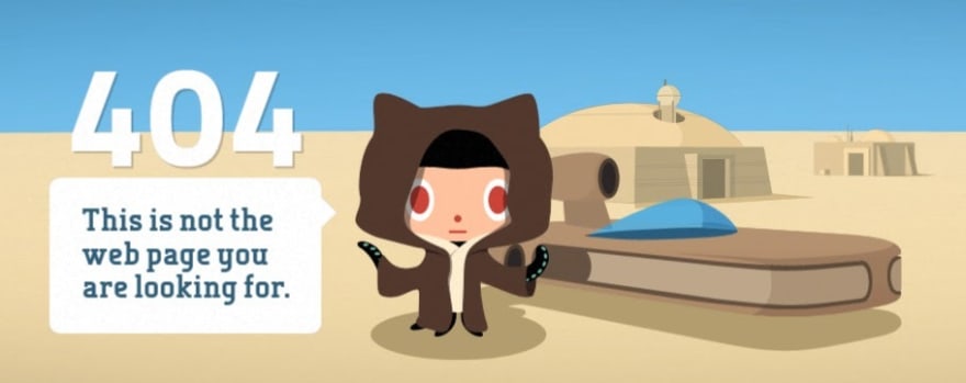
I am updating our website and want to change up the 404 message. We are a developer software enterprise solution company.
Do 404 messages help? Does it matter?
I love to be entertained and hate when there are 404 errors (who doesn't right?), but I am looking for a clever, simple, modern concept. What's your most memorable 404 message. I found a few from a HubSpot article.
GitHub
BrandCrowd 
CSS Tricks !
I found a few other content worthy
I would love to hear from you are your favorite 404 messages. Hit me up!
Thanks for inspiration Rachel Leist @rachelleist
Data Source: https://blog.hubspot.com/blog/tabid/6307/bid/33766/10-clever-website-error-messages-from-creative-companies.aspx


Top comments (9)
Tesla's page used to be a charming reference to the car they launched into space...
Thanks Ben!
I like this one, designed by Julia Klochok. It's the 404 of an eco-food ecommerce.
Thanks Luis
The Financial Times website does it for me:

See it in full here.
Thanks Ben !
Checkout this simple 404 page design by WinBizSolutionsIndia.
Hi,
Check the design used by PGBS.
Hi,
Check the design used by MAP Systems.